
As a society, we’ve grown accustomed to getting our information in real-time. The CBC displays real-time vote counts as they are released for elections, transit operators share their bus locations via General Transit Feed Specification (GTFS) to navigation apps, and recently, maps displaying the spread of the virus and case counts are dominating news headlines.
This real-time data mentality is also spreading to governments, who are increasingly seeing value in adopting real-time data practices to allow them to both display data to the public and to make data-driven decisions. They’re using web maps and other tools to produce interactive dashboards and visuals, which communicate their program and performance data to the public. This is often with the intent to improve government accountability and transparency.
However, government accountability and transparency isn’t achieved by simply sharing and visualizing data, but also by effectively communicating what the data means and how a person can take action as a result of the data. With this in mind, it becomes clear that effectively communicating government performance is a challenging task.
In a recent project to measure the performance of a large-scale transportation funding program in Broward County, Florida, we reviewed over 30 examples of such real-time performance dashboards. Finding the raw data that is feeding the charts proved difficult and we realized that dashboards were often implemented independently from government strategic planning and program management. Without knowing who is in charge of improving the performance in a certain area or what they are doing to improve it, it is hard to hold the government to account on their performance measures.
Below we review dimensions of government performance measure dashboards that have an impact on government transparency and accountability toward the broader public and key stakeholders. We identified three critical hindrances, namely, the lack of access to raw data, outdated performance measures, and data interpretation problems caused by inadequate aggregation units.
1) Accessibility to raw data
Performance dashboards visualize data for easy interpretation but don’t always provide the raw data files for the public and stakeholders’ own exploration and use. From the perspective of open data and open government practitioners, access to the data behind dashboards can facilitate public trust, public participation, and understanding of government performance.
A common feature of transparent and accountable government, alongside performance dashboards, is having open data portals. These can complement the dashboards by providing the machine-readable data used to create performance measures. The data are easily accessible, allowing people to look at the numbers related to government programs and services and use the data for their own purposes (Tauberer, 2014).
For example, London’s Datastore integrates its open data portal and performance dashboard to provide the data, performance measures, and a description of the figures for website visitors.
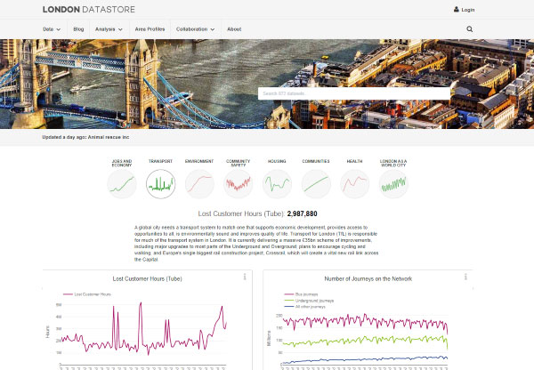
London’s Datastore was the only example we found in our review that hosted the open data in the same place as the performance measure visualizations (note: we focused on select transportation performance dashboards for an environmental scan). Open data portals were often not linked to the performance measure dashboards, separated without any clear direction on where to find the machine-readable data files.
In the case of the Atlanta Regional Commission (ARC), ARC DASH provides many opportunities for website visitors to manipulate the data into various figures and maps (see image below). Their dashboard also does a good job of presenting all data associated with transportation infrastructure projects in their short- and long-term transportation plans.
However, as we found with many other dashboards, it was difficult to get access to the raw, machine-readable files. On the Congestion Management page, the visitor had to go through a third-party platform to access the data, requiring them to switch websites and create log-in credentials.
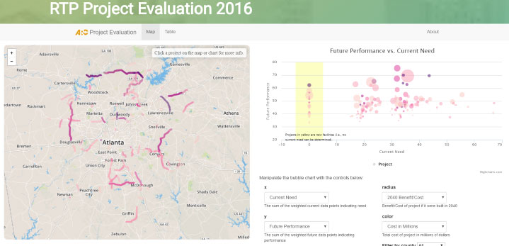
For ARC DASH, this may be easy to remedy as much of the data are available on their open data hub. For example, ARC provides the data for the map that appears on their dashboard (see Figure 2). Linking the performance measures and the raw data clearly would facilitate access to the machine-readable data and limit confusion when the public and stakeholders are trying to assess projects and performance.
2) Relevance: timeliness of data
Performance data is only useful if it is released in a timely manner. If roads are in poor repair or program dollars are being misspent, the public and key stakeholders will want to know as soon as possible so they can ask for change.
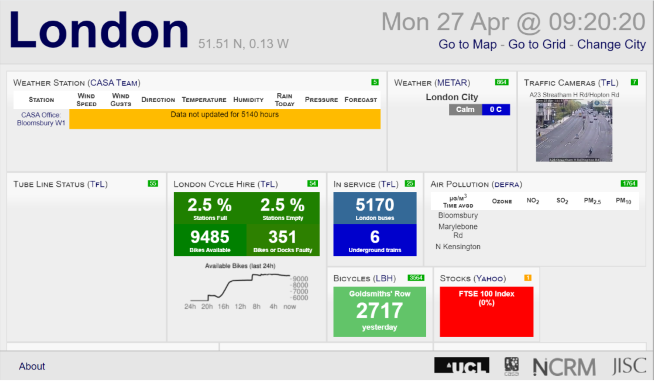
From our review, we found several transportation dashboards with outdated data and performance measures, with very few using data updated in real-time. In one university-based dashboard from University College London, real-time updates are collected from eight cities across the UK. People can use the dashboard to see the availability of London Cycle Hire bikes or to visually evaluate traffic safety and congestion via traffic camera (see Figure 3).
Other dashboards did not have real-time data. In the case of MinnesotaGo, we found that while this dashboard excels at aligning its performance measure data with its overall department of transportation and its goals as well as providing excellent access to measurement and machine-readable data, unfortunately much of the data are out of date.
Outdated performance measures, commonplace among transportation dashboards, don’t give people the opportunity to evaluate current performance by the state, thereby depriving them of the opportunity to use data to ask for concrete changes in their communities.
3) Interpretation of data: spatial units and the Modifiable Areal Unit Problem
While a great communication tool, data visualization can nonetheless be subject to interpretation and be understood differently from one person to the next. Data visualizations on performance dashboards should strive to convey a clear meaning, trend or message. This can become complicated when using maps to display performance data, for slight variations in spatial aggregation methods can seriously impact the interpretation of the data.
Analysts typically anonymize location data on maps by spatially aggregating so that individual data and location cannot be identified. This presents data over an area as an average or aggregate statistic as opposed to individual data points.
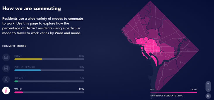
There are many options when aggregating data: using census tracts, counties, cities, states, or other community-based units. In the image below, DistrictMobility, DC’s transportation dashboard, uses wards.
Choosing the spatially aggregated unit, however, can change the interpretation of the data points. This issue is called the modifiable areal unit problem (or, MAUP).
MAUP occurs when patterns and findings can change depending on how the boundaries of the spatial units are defined (McGrew, Lembo, & Monroe, 2014). For example, the number of houses in each sub-area of the three green boxes below change based on how the boundary of the areas are defined (counts listed). As you can see in Figure 5, if you live in the top right house, the number of neighbours in your community changes according to the neighbourhood boundary.
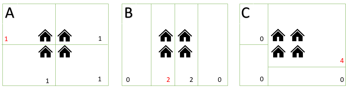
Extrapolating to transportation and urban planning, such issues could also result in a lack of attention paid to residents in areas that need sidewalk improvements, traffic lights or other infrastructure and amenities to improve safety, leading to different government resource allocation and policy outcomes. The sidewalk issues that caused the injury in the top left house may extend to all of the homes. These would all only be addressed in situation C, where all houses are in the same neighbourhood.
MAUP is a difficult issue to remedy. Analysts should try to use the smallest units possible when creating maps to best display the underlying data. If there are a few polygon options to choose between, it is best to consult experts in the field or people with knowledge of the topic area, as there are often data unit standards that make data comparable across governments and research domains.
There continues to be room to improve transparency, accountability, and inclusiveness in government through data and performance on government dashboards. Connections between the open data and open government community, and producers of spatial data to ensure that data remains coordinated. In this post we highlight three examples where governments can provide more information to the public through machine-readable data, timely release of data, and the best use of geographic units for proper interpretation of data.
In our data-driven world, there is still room for improvement to ensure the best decisions are made for the public. We look forward to continuing this work with future partners!
This blog post is inspired by our recent work with Broward County, FL. Broward County is currently in the second year of its Mobility Advancement Program, an initiative to enhance connectivity and alleviate congestion throughout the country through projects funded by surtax revenues. Open North completed research on performance measurement and online dashboards to support the development of this program.
Sources
Matheus, R., Janssen, M., & Maheshwari, D. (2018). Data science empowering the public: Data-driven dashboards for transparent and accountable decision-making in smart cities. Government Information Quarterly, 101284.
McGrew Jr, J. C., Lembo Jr, A. J., & Monroe, C. B. (2014). An introduction to statistical problem solving in geography. Waveland Press. Third Edition.
Tauberer, J. (2014). Open government data: The book. Joshua Tauberer. https://opengovdata.io/